Area Under the Curve and Beyond with Integrated Discrimination Improvement and Net Reclassification
Contents
TLDR
- AUC is a good starting metric when comparing the performance of two models but it does not always tell the whole story
- NRI looks at the new models ability to correctly reclassify event and nonevents and should be used alongside AUC
- IDI quantifies improvement in discrimination slopes, while reclassification plots can provide information AUC alone does not afford.

Area Under the Curve (AUC)
In machine learning and diagnostic medicine the area under the receiver operating characteristic (ROC) curve or AUC is a common metric used to evaluate the predictive performance of a model or diagnostic test. New models are often bench marked against established models using AUC. Comparing AUCs of new and old models to evaluate improvement is a good place to start however, many end their analysis here and believe that simply reporting a higher AUC is sufficient. AUC can be misleading as it gives equal weight to the full range of sensitivity and specificity values even though a limited range, or specific threshold, may be of practical interest. In this article, we show how to fully interrogate new and improved model performance, beyond simple AUC comparisons, as to provide a more comprehensive understanding of improvements within the context of a given problem. We also present a coded example, in Python, to demonstrate the concepts we present.
Example: Breast Cancer
Code for the following example and useful AUC, NRI, IDI functions can be found at github. The package is now distributed as more-metrics, which provides typed, side-effect-free functions for AUC, NRI, IDI, bootstrap confidence intervals, permutation comparisons, and plotting.
Breast cancer is the leading cause of cancer death in women world wide. Early detection has helped to lower the mortality rate and the earlier a malignancy is identified, the more likely a patient is to survive. As such, great effort has been allocated to developing predictive models to better identify cancer. In this example we use extracted imaging features to build models to predict malignancy probability. We use data from the Diagnostic Wisconsin Breast Cancer Database [1] housed at the UCI Machine Learning Repository.
As mentioned previously, AUC gives equal weight to all thresholds but this may not be practical in the context of breast cancer diagnosis. The Breast Imaging Reporting and Data System or (BI-RADS) [2]. provides a course of action for a given probability of malignancy. In short, if the probability of malignancy is greater than 2%, a biopsy is recommended. Biopsies are invasive procedures and they can be physically and mentally detrimental to patients. A new and improved breast model would ideally be better at identifying cancers (sensitivity increase) and reducing false positives (specificity increase), preferably below 2% to avoid invasive and unnecessary biopsies.
We set up the example with the following code snippets. The package requires Python 3.10 or later and can be installed with
python -m pip install more-metrics.
Example Set up
# Import Modules #
import os
import sys
import numpy as np
import pandas as pd
from sklearn.ensemble import RandomForestClassifier
from sklearn.datasets import load_breast_cancer
from sklearn.model_selection import train_test_split
from more_metrics import (
    bootstrap_auc,
    categorical_nri,
    continuous_nri,
    idi,
    plot_reclassification,
    plot_roc_comparison,
)
After we import the necessary modules, we load the breast cancer data set and split the data into a train and test set. Note, it is best practice to also create a validation set and we would normally do that but for the sake of this example we will stick with just a training and test set.
# Import data #
data = load_breast_cancer()
# Create DataFrame and Split Data
df = pd.DataFrame(data=data['data'],columns=data['feature_names'])
df['label']=data['target']
x_train, x_test, y_train, y_test = train_test_split(df.iloc[:,:-1], df.iloc[:,-1], test_size=0.40, random_state=123)
Also for the sake of this example, we will pretend that our reference/bench mark model was built on breast imaging features pertaining to texture, concave points, smoothness, fractal dimension, and compactness. We will also pretend that the new model uses additional imaging biomarkers/features which pertain to radius, perimeter, area, symmetry, and concavity. In total, the reference model is built using a total of 15 features while the new model is built using 30 features (15 features used by the original model and 15 new features). The following code snippet creates to two sets of features.
# create ref and new model feature sets #
ref_feat, new_feat = [],[]
for i in data['feature_names']:
    if 'fractal' in i or 'smoothness' in i or 'texture' in i or 'concave' in i or 'compactness' in i:
        ref_feat+=[i]
Modeling
We create a reference or “ref model” with 15 features and the “new model” with all 30 features.
# init models
ref_model = RandomForestClassifier()
new_model = RandomForestClassifier()
# fit models to train data
ref_model.fit(x_train[ref_feat], y_train)
new_model.fit(x_train[new_feat], y_train)
# make predictions on test data
test_ref_pred=ref_model.predict_proba(x_test[ref_feat])
test_new_pred=new_model.predict_proba(x_test[new_feat])
Issues with Comparing Models AUCs
We previously mentioned that comparing AUCs is a good starting point. We do that here to get an idea of how the new model performed with respect to our reference model. The current package separates the numerical AUC calculation from plotting, so we first calculate stratified bootstrap estimates and then pass those typed results into the plotting helper.
ref_auc = bootstrap_auc(
    y_test.values,
    test_ref_pred[:, 1],
    n_resamples=100,
    random_state=42,
)
new_auc = bootstrap_auc(
    y_test.values,
    test_new_pred[:, 1],
    n_resamples=100,
    random_state=42,
)

fig, ax = plot_roc_comparison(ref_auc, new_auc)
We run the following to generate AUC plots.
fig.savefig('auc_ci_example.png', dpi=300, bbox_inches='tight')
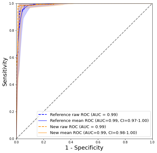
Figure 1: AUC curves with confidence intervals calculated using bootstrapping
The AUC estimates and pointwise ROC uncertainty bands in Figure 1. were calculated via 100 rounds of bootstrapping, see code above. The reference (blue curve) and new model (orange curve) produce similar AUC at 0.99 and 0.99, respectively. The interval is slightly narrower for the new model. Overall, it is difficult to draw any meaningful conclusion from the AUC curves alone and it would appear that the new model with additional features did little to nothing to improve malignancy predictions.
Beyond the Area Under the Curve
Our example in Figure 1. demonstrates how using only AUC can be limiting and suggest that analysis needs to go beyond simile AUC comparision. We present two additional metrics which are commonly used to asses the impact of new features or biomarkers on a model. These metrics include the net reclassification index (NRI) and the integrated discrimination improvement (IDI) [3]. These two metrics will help in understanding the actual differences in the two models that may not be obvious in Figure 1.
Net Reclassification Index (NRI)
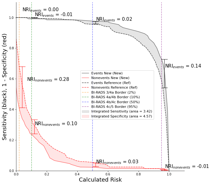
The NRI is derived by summing the number of NRIevents and NRInonevents. In our example, events are synonymous to patients with cancer or maligancies and NRInonevents are synonymous to patients who do have benign findings. The NRIevents is the net proportion of patients with events reassigned to a higher risk category and the NRInonevents is the number of patients without events reassigned to a lower risk category [4]. We compute the NRI using the package function for categorical net reclassification improvement. In other words, the function uses the prespecified clinical thresholds, keeps the event and nonevent components separate, and returns a named result object rather than an unlabeled tuple.
risk_thresholds = [0.02, 0.10, 0.50, 0.95]
nri_result = categorical_nri(
    y_test.values,
    test_ref_pred[:, 1],
    test_new_pred[:, 1],
    thresholds=risk_thresholds,
)
We input both the reference and new models predictions into the NRI function to calculate the events, nonevents, and total NRI.
print((nri_result.events, nri_result.nonevents, nri_result.total))
The output from the code above is:
0.1642857142857143, 0.125, 0.2892857142857143
It is tempting to state that “the new model reclassified 29% of the patients when compared to the reference model” however, this would not be an accurate statement nor a proper interpretation of NRI. Since the NRI is the sum of the proportion of events and not events it is possible to have an NRI of 2 or 200%. Stating that the new model reclassified 200% more individuals is not possible because it implies that there are suddenly twice as many patients.A more correct interpretation would be to state that the new model correctly classified 16% more cancer cases and 13% more benigns when compared to the reference, totaling a overall NRI of 29%.
The NRI show us that adding more features to the new model reclassified both malignant and non-malignant patients. This information could not be concluded from AUC alone and may have incorrectly led people to think the models were the same. In a clinical setting, the new model would have found more cancers which could potentially save more lives. Also, the new model would have correctly identified more benigns which would translate to less stress for an individual and potentially sparing them from having and invasive procedure like a biopsy.
Continuous NRI, which is also called category-free NRI or cfNRI, is a newer metric and tracks overall movement of event and nonevents, irrespective of class.
For our breast cancer example, the American College of Radiology (ACR) has distinct BI-RADS classes and therefore we do not
find the need to calculate the cfNRI. The package now calls this continuous_nri, and equal reference and new probabilities
are treated as no movement.
continuous_result = continuous_nri(
    y_test.values,
    test_ref_pred[:, 1],
    test_new_pred[:, 1],
)
print(continuous_result.events, continuous_result.nonevents, continuous_result.total)
Integrate Discrimination Index (IDI)
The IDI is a measure in the change of the discrimination slopes and shows the impact of new biomarkers on a binary predictive model. The current package calculates the standard IDI as the new model’s discrimination slope minus the reference model’s discrimination slope. In other words, it asks whether the new model increased the average predicted risk among cancers and decreased the average predicted risk among benign findings. The function returns the event component, nonevent component, reference slope, new slope, and total IDI as named fields.
idi_result = idi(
    y_test.values,
    test_ref_pred[:, 1],
    test_new_pred[:, 1],
)

print(idi_result.events, idi_result.nonevents, idi_result.idi)
print(idi_result.reference_slope, idi_result.new_slope)
When visualization is useful, the package now treats it as a separate reclassification plot rather than an IDI curve. This keeps the statistical calculation and the figure generation distinct.
fig, ax = plot_reclassification(
    y_test.values,
    test_ref_pred[:, 1],
    test_new_pred[:, 1],
    nri_result,
    threshold_labels={
        0.02: 'BI-RADS 3/4a Border (2%)',
        0.10: 'BI-RADS 4a/4b Border (10%)',
        0.50: 'BI-RADS 4b/4c Border (50%)',
        0.95: 'BI-RADS 4c/5 Border (95%)',
    },
)
Figure 2: Historical risk-distribution visualization with calculated NRI at each class or BI-RADS border
The dashed and solid curves in the historical figure represent the reference and new model respectively. In the ideal case, the solid black line would be moved to the upper right indicating the most improvement to sensitivity and the red line would be lowered to the bottom right indicating the most improved specificity. However, the current package no longer defines IDI as the area between these curves. It calculates standard IDI from the change in discrimination slopes and uses reclassification plots only as a visualization. The BI-RADS 3/4a border is still clinically important because it is recommended that all patients with BI-RADS 4 or greater receive biopsies [6]. A positive NRInonevents at this threshold still indicates that the new model moved more benign findings in the clinically helpful direction, which could spare some patients from unnecessary biopsy.
Final Thoughts
AUC is a good metric but does not provide all the information needed for a comprehensive analysis of the impact of new biomarkers and models. The NRI and IDI should be used to complement AUC findings and interpretations. As a data scientist and cancer researcher who uses Python, it was difficult to find functions and code snippets that computed NRI and IDI and visualized reclassification. This was my motivation for posting this and I hope that my code can help other in their research, discoveries, and pursuit of better health care solutions.
References
[1] Dua, D. and Graff, C, (2019), Irvine, CA: University of California, School of Information and Computer Science, UCI Machine Learning Repository [http://archive.ics.uci.edu/ml].
[2] Understanding mammogram reports: Mammogram results. (n.d.). Retrieved May 06, 2021, from https://www.cancer.org/cancer/breast-cancer/screening-tests-and-early-detection/mammograms/understanding-your-mammogram-report.html
[3] Pencina, M. J., D’Agostino Sr, R. B., D’Agostino Jr, R. B., & Vasan, R. S., Evaluating the added predictive ability of a new marker: from area under the ROC curve to reclassification and beyond, (2008), Statistics in medicine, 27(2), 157-172.
[4] Pencina, M. J., D’Agostino Sr, R. B., & Steyerberg, E. W., Extensions of net reclassification improvement calculations to measure usefulness of new biomarkers, (2011), Statistics in medicine, 30(1), 11-21.
[5] Pickering, J. W., & Endre, Z. H., New metrics for assessing diagnostic potential of candidate biomarkers, (2012), Clinical Journal of the American Society of Nephrology, 7(8), 1355-1364.
[6] Leong, L., Malkov, S., Drukker, K., Niell, B., Sadowski, P., Wolfgruber, T., … & Shepherd, J., Dual-energy three compartment breast imaging (3CB) for novel compositional biomarkers to improve detection of malignant lesions, (2021).